
Slow Dancing Art Process

DISCLAIMER: This article started from a series of vlogs in 2023, and the videos show my emotional state at the time - feeling suffocated, anxious, depressed, dealing with sickness and grieving. Unfortunately, the videos won't be published anymore, but the article will.
The fact that I'm a BTS fan isn't a surprise to anyone, but this art piece already has a vlog, and I've decided to write an article about its creative process as well. Personally speaking, writing nowadays feels much easier than filming, especially because I still struggle with the post-production part of it.
가자, or “let's go”, as you wish.
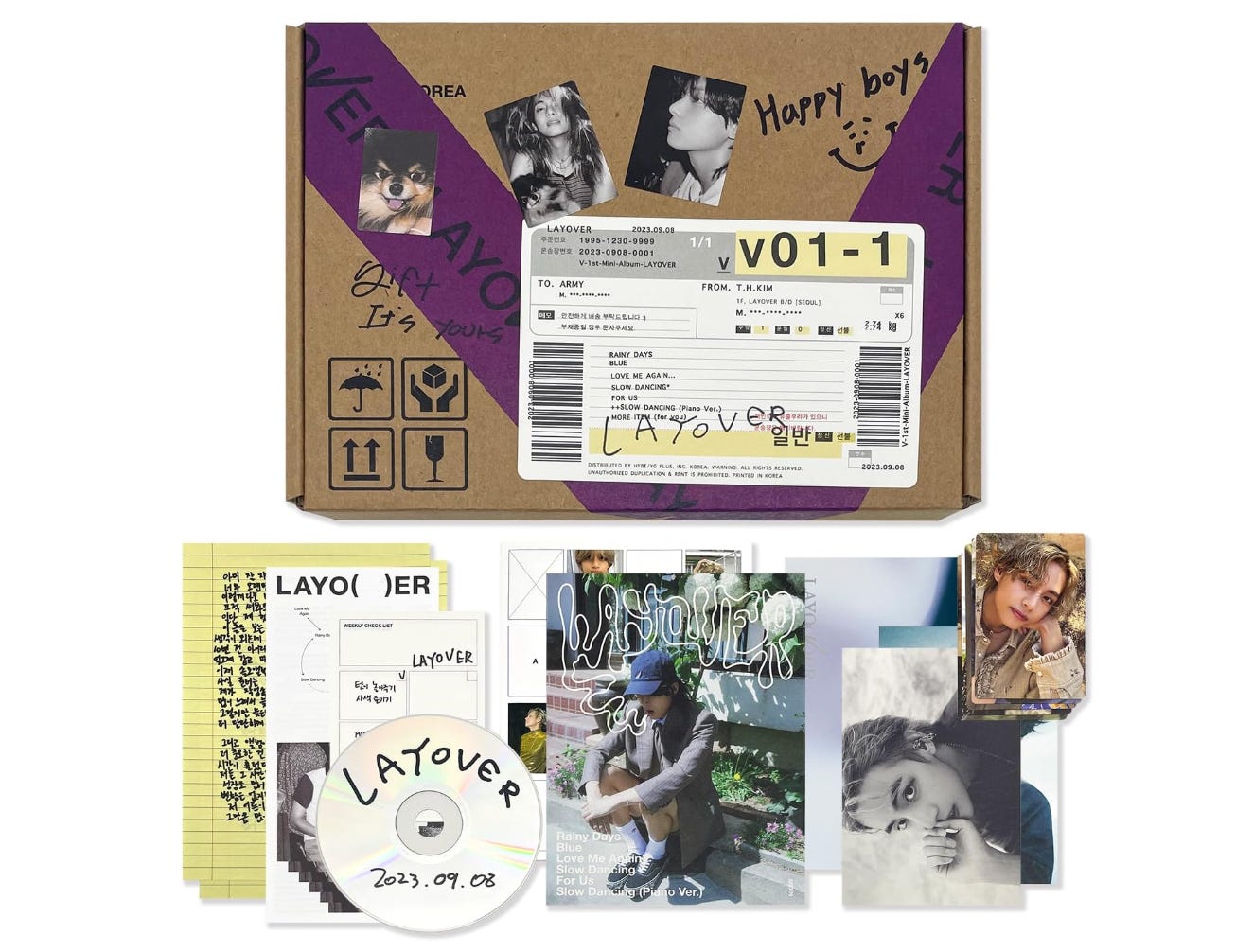
As you can see from the photo above, the album identity showcases a rare phenomenon in the graphic design field: featuring a photo of your own dog in your brand identity doesn't necessarily compromise the overall identity. But the whole album felt like it was entirely handwritten by him, on a box like a delivery packaging, and it even contains a notepad (like I'm someday going to actually use it instead of keep it closed in a safe so no one can ever touch it) to note tasks or things to pack when traveling.
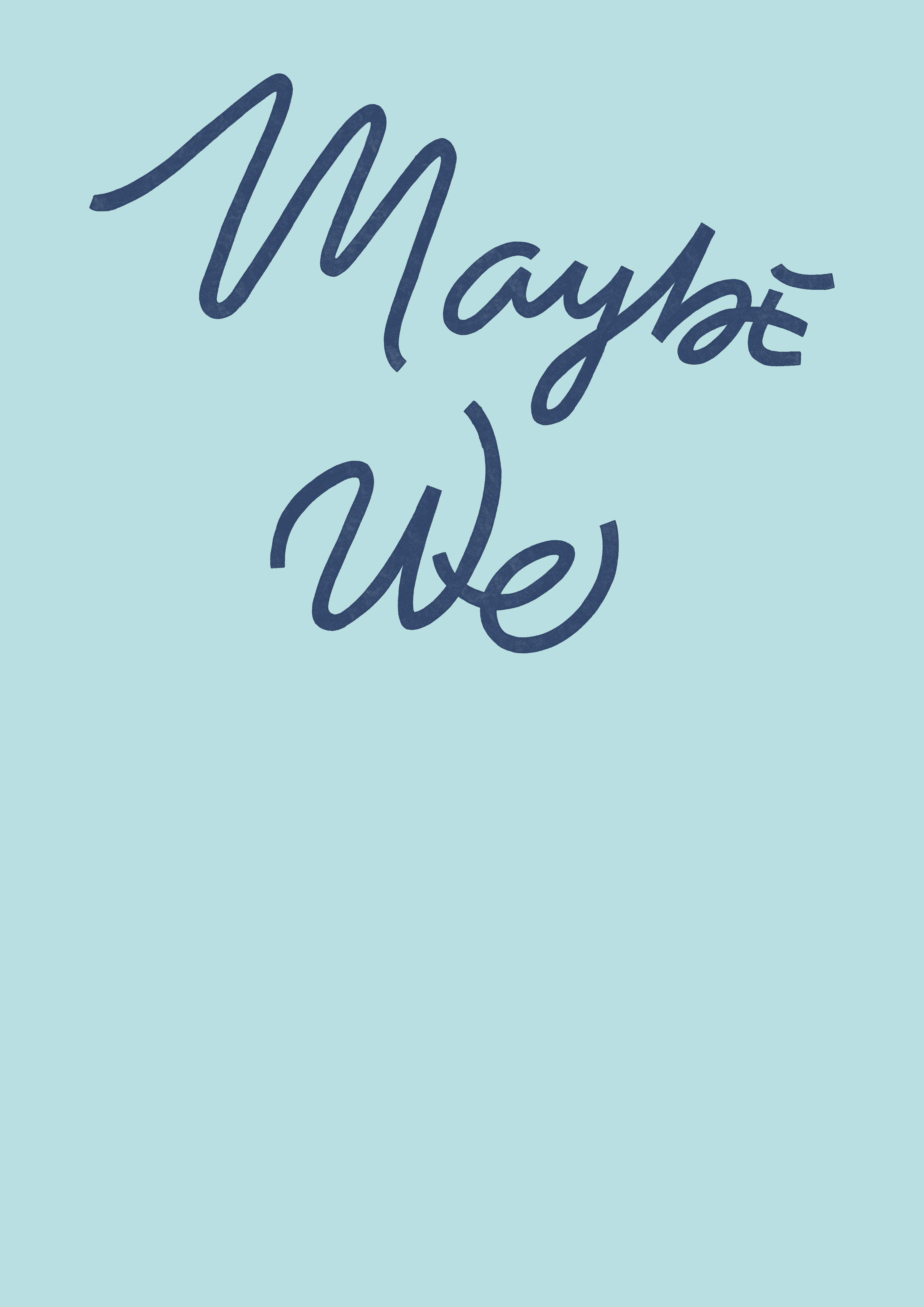
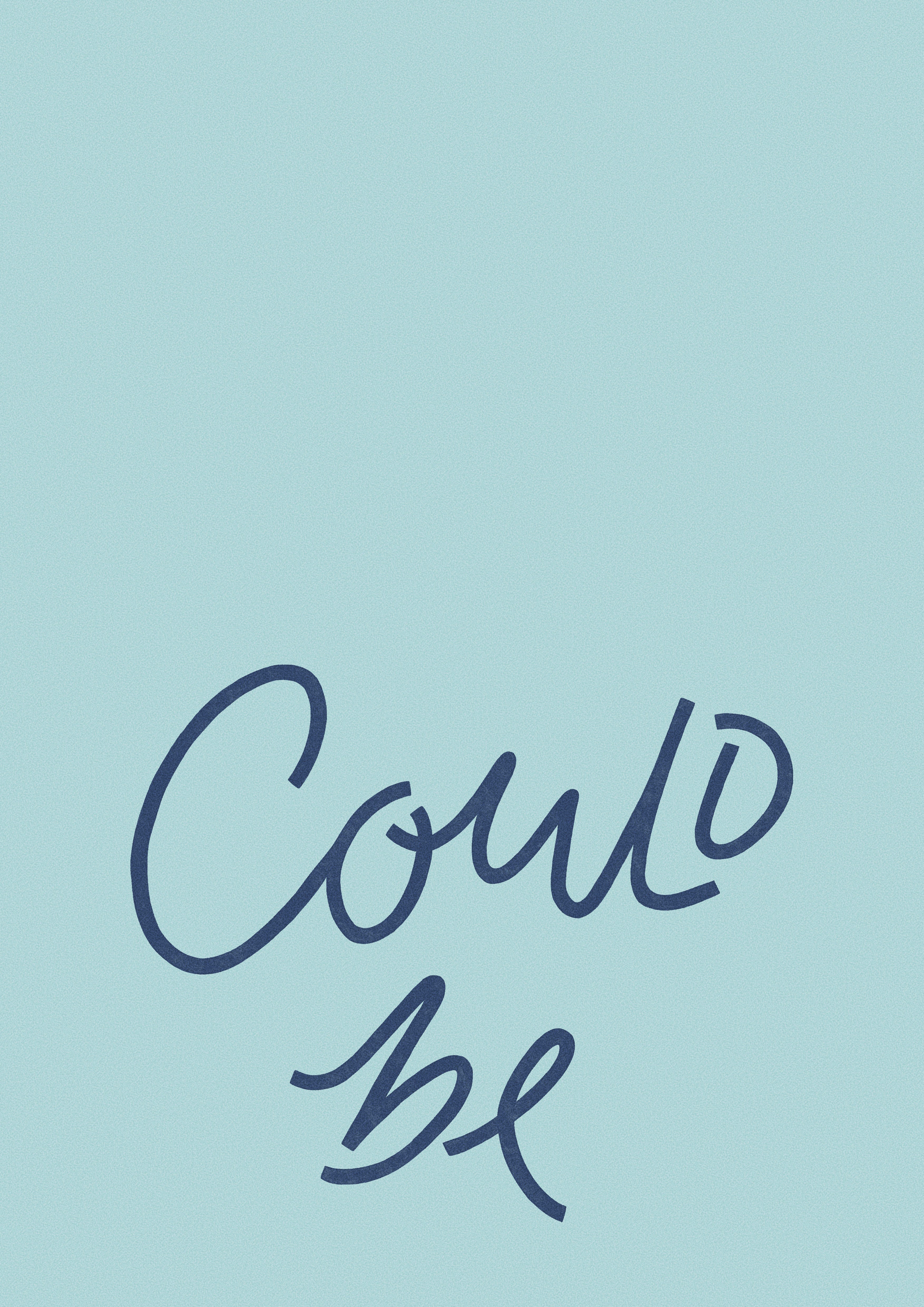
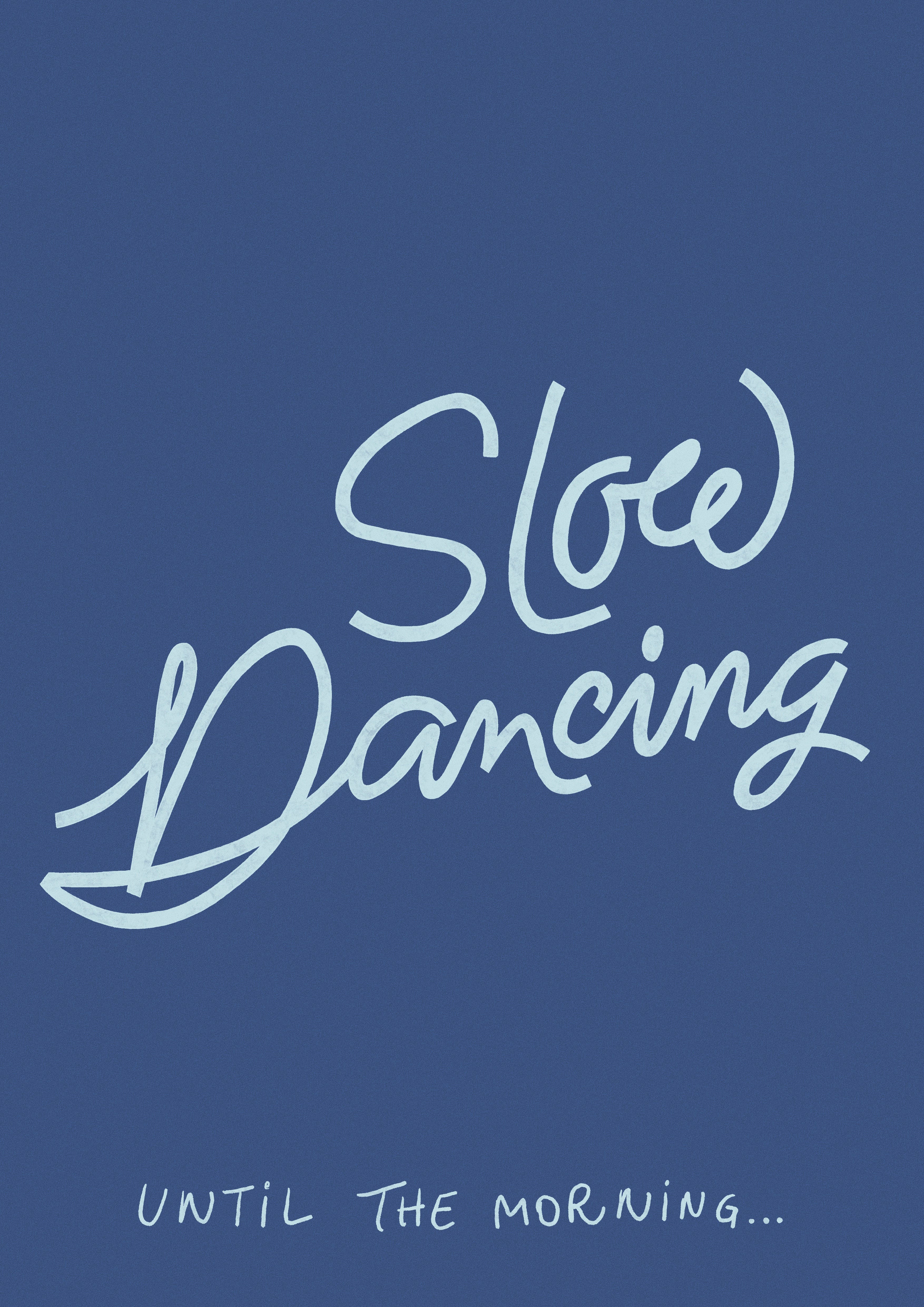
The song chosen was Slow Dancing (Piano ver.), because I like the jazzy vibe at the end, and also, when I was listening to it, I had already imagined what I wanted to create, so it just flowed. And the quote chosen was “Maybe we could be Slow Dancing, until the morning", but listening to the rhythm, only one or two arts wouldn't be enough, so I decided to create three:
Maybe we
Could be
Slow Dancing, until the morning
That way, when reading the artworks, you can also kind of sing along.
SKETCH DA PRIMEIRA COMPOSIÇÃO SÓ PRA TESTAR
For the lettering style, the song is very flowy and calm, happily not in a way that makes you feel sleepy. So I first thought about a script style, but instead of a classic, jazzy style, I thought about something a bit more contemporary - like it was handwritten but without being sloppy or careless.
When creating, I usually go to cafeterias that are very calm and if they have a jazz vibe, it's even better. The ones I used to go when in my hometown were these:
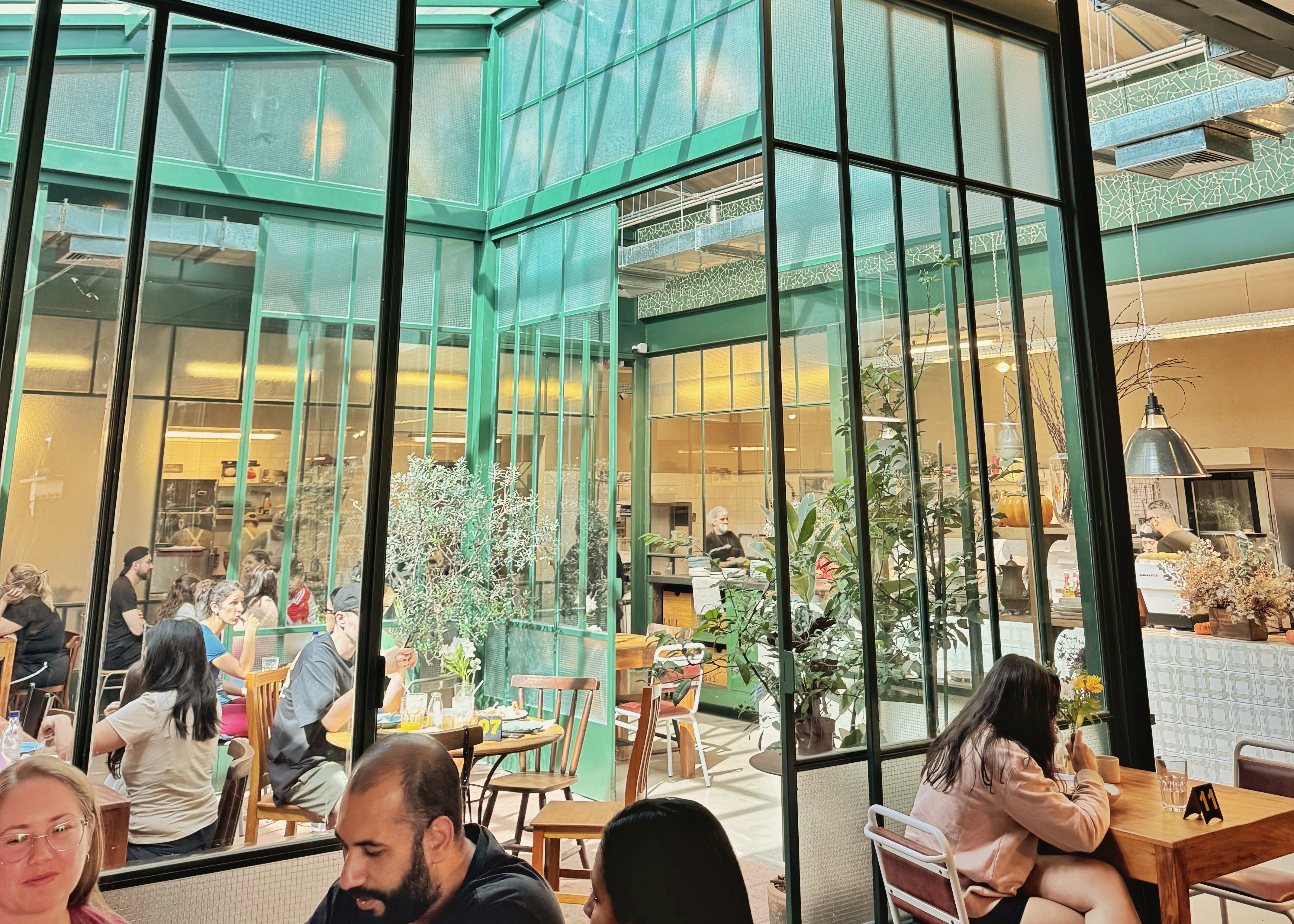
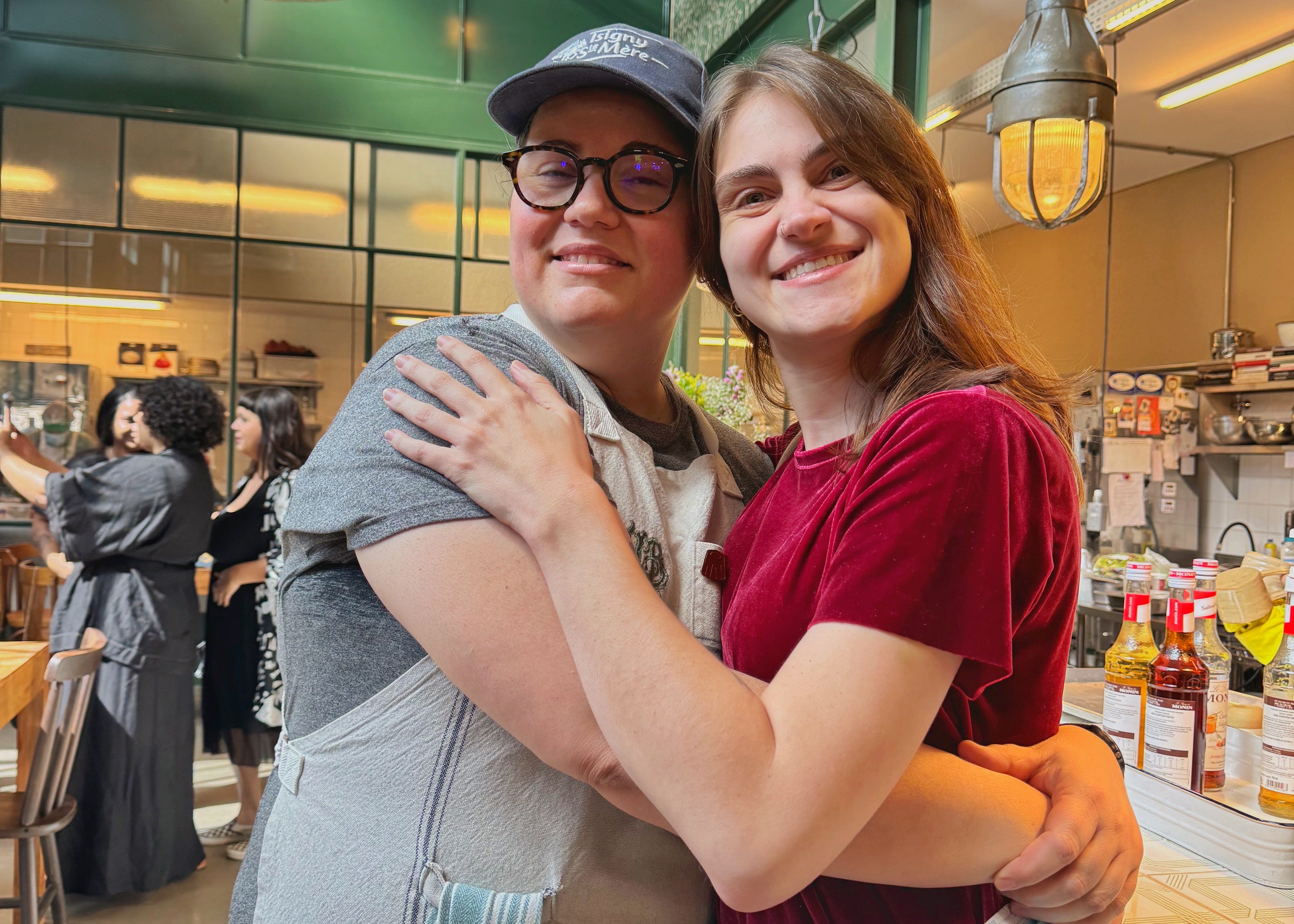
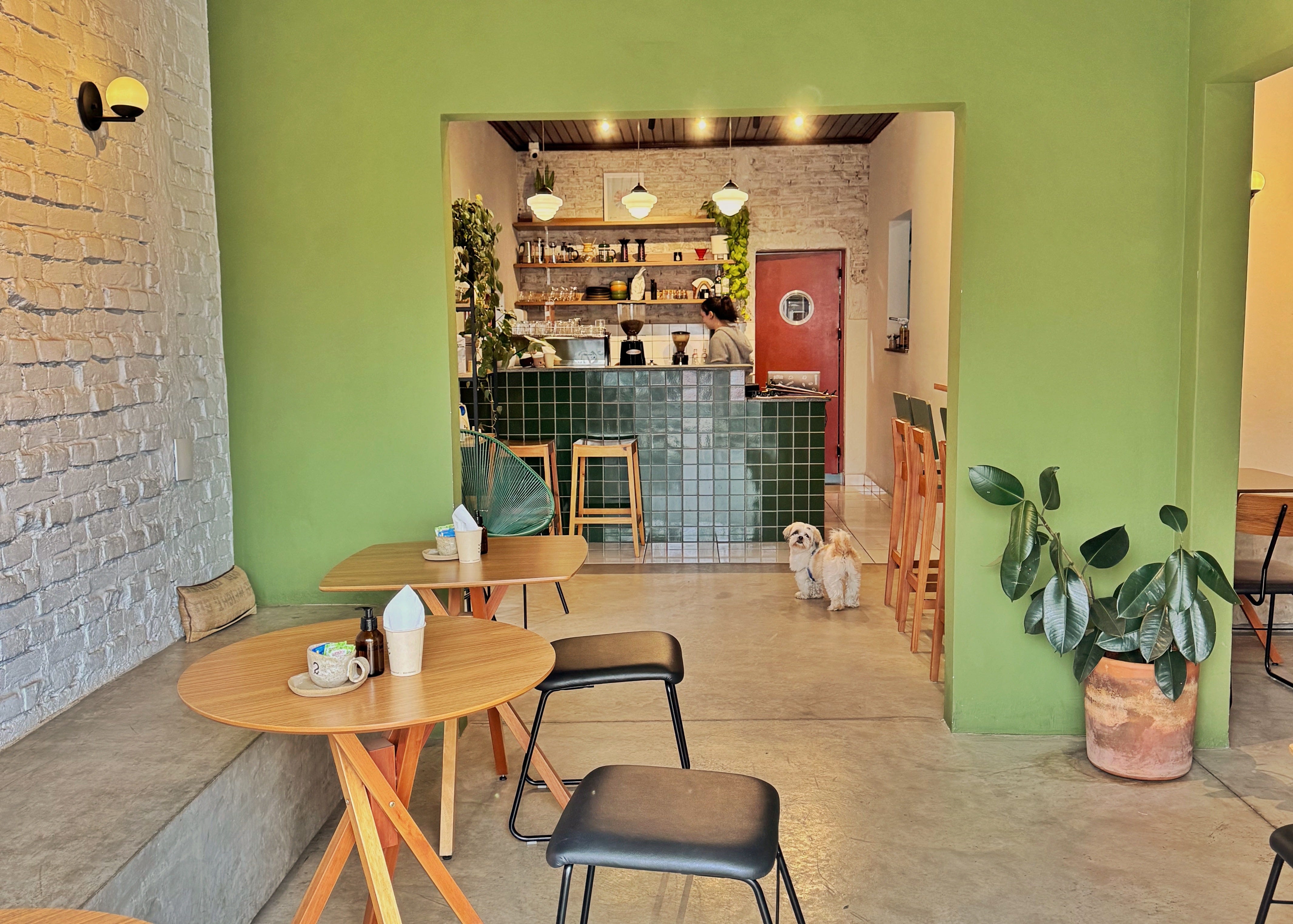
If you live near Americana, Sao Paulo (or even in Sao Paulo), you MUST visit these places - I promise it's worth the 2-hour trip.
Regarding references, obviously the main reference is the Layover album itself, but aside from that, I actually watched and studied every single promotional video, interview and behind-the-scenes video V did. I've also analysed the visual concept of Rainy Days and Slow Dancing MVs, even though the lettering created was based on Slow Dancing.
With that in mind, time for Pinterest references and create my own aesthetic!
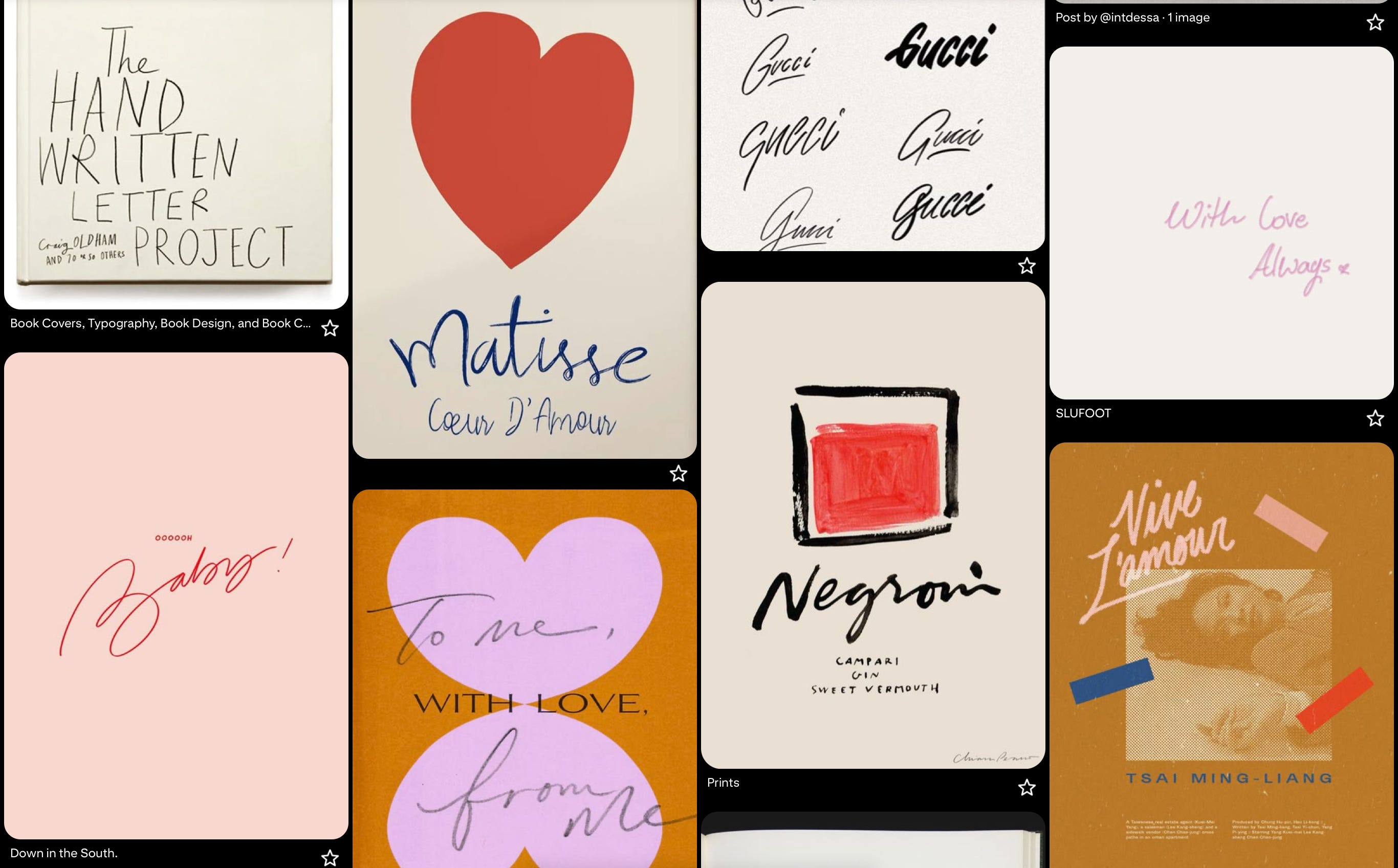
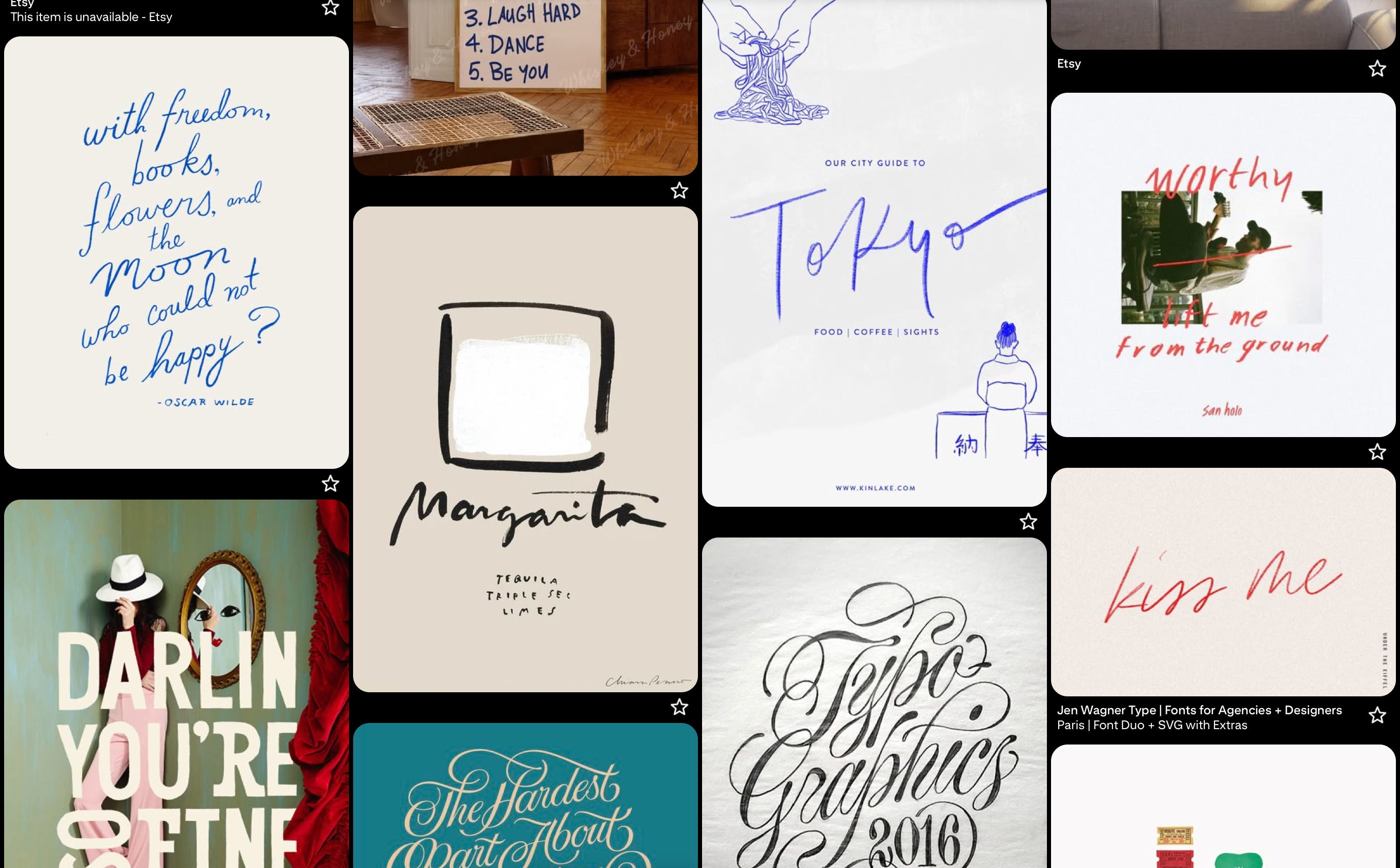
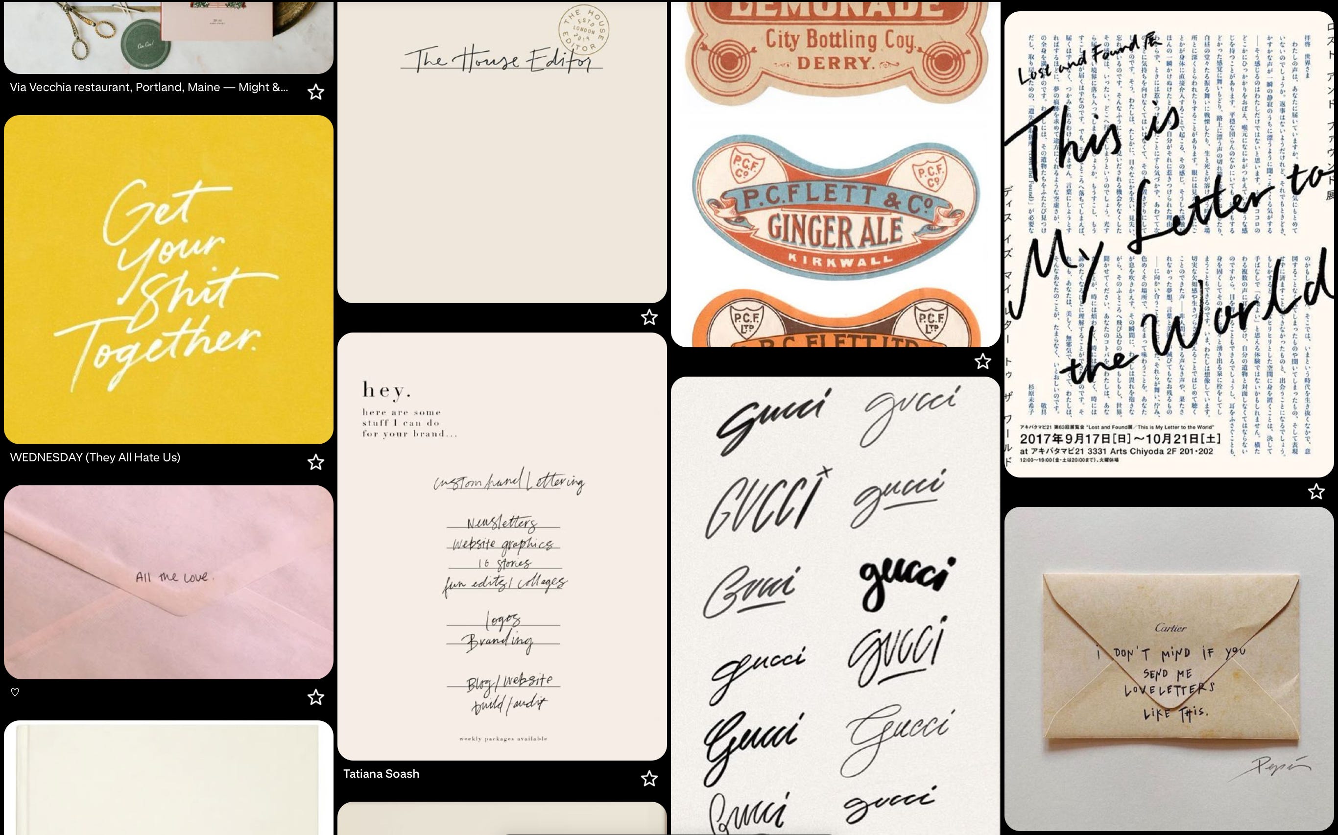
After studying deeply the album and every content he created to promote it, I gathered a few keywords to help me understand the concept I'd like to create around the arts, and as he used his own handwriting on some pieces of the album, I decided to use my own handwriting as well on the third art, at the bottom, as you can see here:
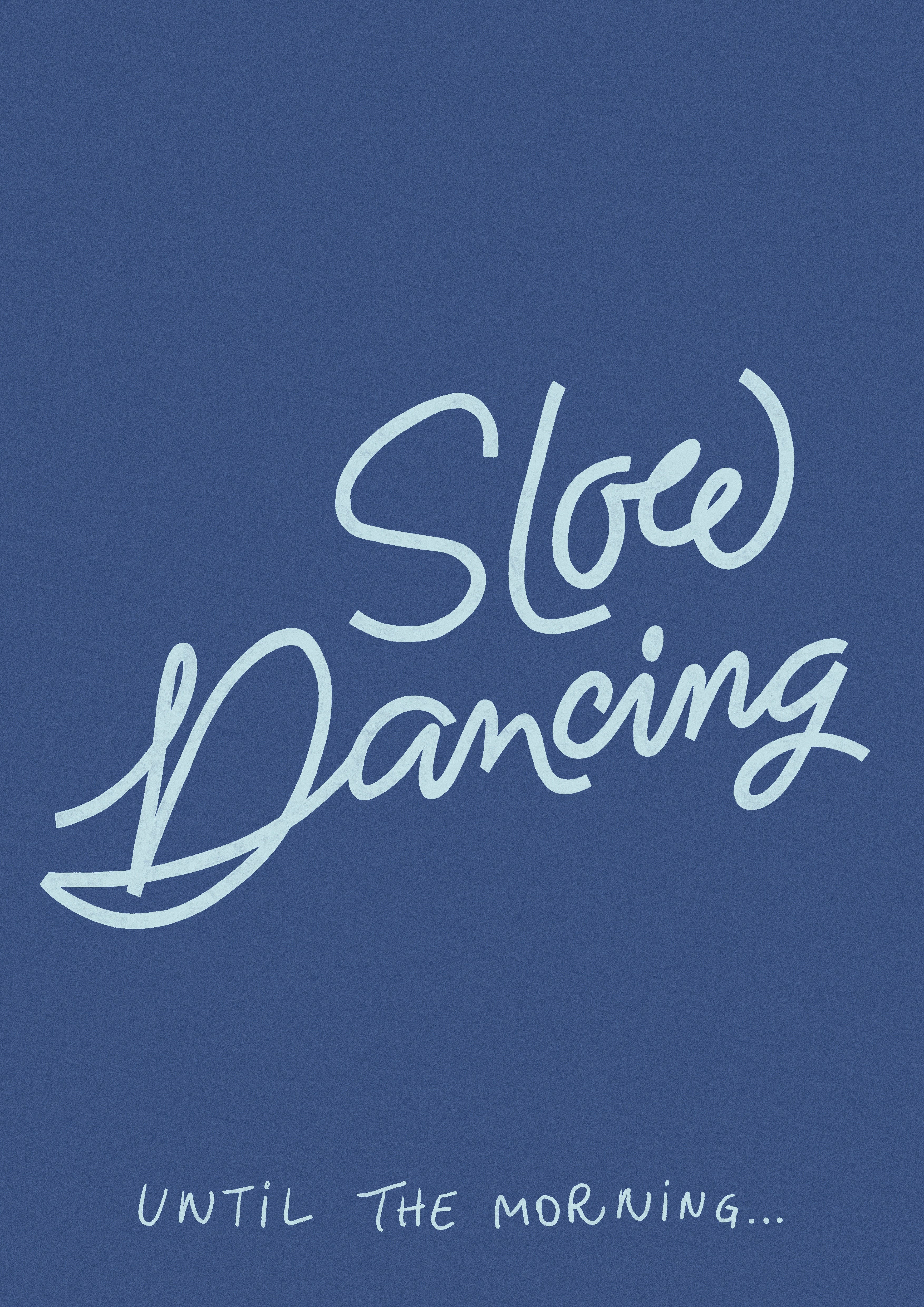
Now let's jump to the final artworks:
And three years later, understanding the limits that even though I'd love to have done a vlog, but done is better than perfect, and I'm still super proud of this.
And lastly, BTS is 7, so finally Jungkook's art is already being created as well, so stay tuned!